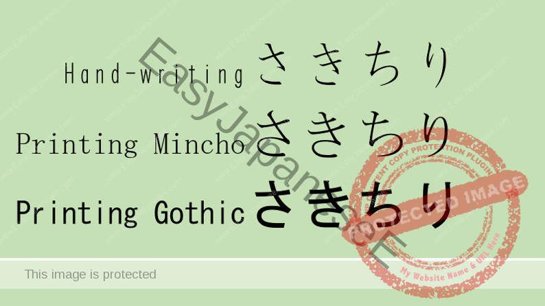
Today’s blog is about Fonts we use in Japanese.
When you are reading this blog, you realize the letter “a” is written as you see it but nobody writes “a” like that when hand-writing it and probably you didn’t even notice “a” is typed differently from the way you would usually write it.
The same thing happens in Japanese too.
In the above slide, the top line is typed using a font called “kyokashotai”, which means textbook font. All textbooks used at primary schools in Japan are typed with this font or equivalents and they resemble correctly hand-written letters.
Yet, this “kyokashotai” font is not included in the Japanese language pack for non-native Japanese computers, so you would usually see all the letters written like the middle and bottom lines in the slide, which makes it very difficult to realize that さ (sa) and ち (chi) are NOT mirror image. さ (sa) has 3 strokes, not 2, while ち (chi) has only 2 strokes and looks really like “5.”
Even though your chances of hand-writing Japanese may be low, it would be best you learn it in the correct font. If you’d like a Hiragana chart written in the textbook font. Email or text me, I will send a copy in PDF to you.

